I've discovered a new category in the informal Awful Book Design Contest, of which Ugliest Book Cover has so far been my only category (examples here and here). The new category is called....wait for it... Awful Author Photos!
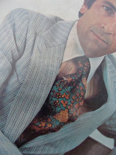
Exhibit A: The Tie
As you may remember, I have these adventures in the library stacks called Weeding, and if you want to see the criteria I work with you can reference this post.
Exhibit B:
The author's serious expression, coupled with pose
(Extra points for light blue pin-striped suit, also)
So this is my winner, so far, in the AAP category. And really, when you take it all together, it's a pretty strong entry: the tie, the suit, overall pose, and let's face it, also the author's first name in conjunction with the former. It's nothing about the author himself, mind you, nothing personal, and I haven't read the book either. But suffice it to say that this is one made it to the big library in the sky.
P.S. Also, check this out, great librarians think alike because there is another post out there from a blog called Awful Library Books about Those Amazing Leeches (Ugliest Book Cover of All Time, year one). Except if you check the date, I broke the story first, that's right, you read it here first, ladies and gentlemen. (Wait, do I have any gentlemen readers?)


